|
|
CLIENT PROFILE: ArtsCard |
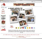
Kartouche worked with ArtsCard, an arts and entertainment discount membership service, for about six years beginning in late 2000. During that time, the program expanded to additional cities in other states. We produced a host of items — publication ads, rack cards, flyers, corporate/venue marketing,
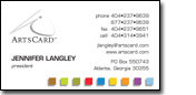
membership cards, business cards &
stationery, signage, and the web site — working closely with Jennifer Langley, the founder and executive director.
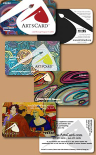
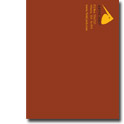
Several of the annual membership cards are shown to the right. In the early years, the logo appeared on a plain silver background. The color would change to indicate a new season, and that color carried through all the collateral for that year as well as the web site. Then, ArtsCard started featuring work of various artists, and the color scheme was drawn from that year's art.
|
 |
 |
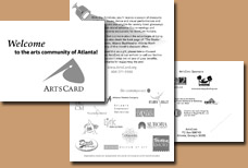
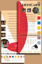
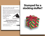
Another part of the annual package was the folder in which the membership cards are sent. Because ArtsCards can be given as gifts, these briefly explain the program and provide the web site address for more information along with a contact phone number. Early versions included sponsor acknowledgements; in later versions, the featured artist is credited.
The 2003-04 version (center), which also doubled as a rack card advertisement, was mailed in a bright yellow-green #10 envelope with the membership card itself attached over the card's image with a sticky glue dot.
 The return address was printed on the back panel of the 2005-06 folder (bottom) so it could be mailed in a clear A2 envelope. Again, a glue dot was used to secure the membership card, on the inside right panel. The return address was printed on the back panel of the 2005-06 folder (bottom) so it could be mailed in a clear A2 envelope. Again, a glue dot was used to secure the membership card, on the inside right panel.
|
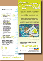
 In the 2004-05 season, we introduced a series of small multi-colored squares as a graphic element. This provided the "fun" factor Jennifer was looking for, and, because we included some colors from previous years, it also lent a sense of history and continuity. Items such as business cards and collateral could be used during any season, saving annual labor and re-printing costs. In the 2004-05 season, we introduced a series of small multi-colored squares as a graphic element. This provided the "fun" factor Jennifer was looking for, and, because we included some colors from previous years, it also lent a sense of history and continuity. Items such as business cards and collateral could be used during any season, saving annual labor and re-printing costs.
The squares graphic was added to the website as well. |
 |
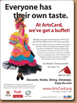 |
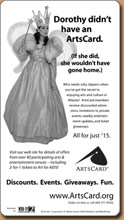
Display advertising was designed with a clean, simple style. A character or object is shown on a white background. The type is a friendly, easy-to-read sans-serif face. The ad is bordered with a 1-point single rule with rounded corners.
Ad images and headlines are tailored to the publication's audience. We made Wizard of Oz references for a gay newspaper (left, upper) and played off a Carmen Miranda-like costume for a special dining section (left, lower). |
The ad series which ran in the Atlanta Journal-Constitution, a postcard for holiday gift sales (above right), and even a corporate flyer (below right) have this recognizable look, too. |
 |
 |
|
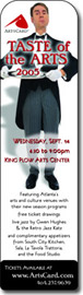 For Taste of the Arts 2005, Jennifer wanted a slightly more "upscale" feel, so we chose a formal butler with silver serving platter as our character, added a shadow, and used a more stylized yet still sans-serif font for the text. To reinforce this event as the kickoff of the 2005-06 season, we used the typeface from the new membership card for the headline. For Taste of the Arts 2005, Jennifer wanted a slightly more "upscale" feel, so we chose a formal butler with silver serving platter as our character, added a shadow, and used a more stylized yet still sans-serif font for the text. To reinforce this event as the kickoff of the 2005-06 season, we used the typeface from the new membership card for the headline.
Kate has assisted in the setup and staffing of a few of these annual parties where members get to preview the upcoming seasons of ArtsCard-participating venues, while enjoying live entertainment and sampling appetizers provided by partner restaurants. |
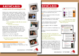 |
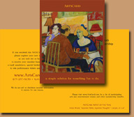
In addition to its advertising for members, ArtsCard markets to corporations and non-profit organizations to use ArtsCards as a promotional premium or thank-you gift or for fund-raising sales. We developed a "one-sheet" — containing an overview of the program, demographic information, descriptions of the e-news and web site, and media quotes — that could also be given to venues which are interested in providing benefits.
This version was primarily distributed as a PDF via e-mail. |
|
Over the years, we revised and expanded the ArtsCard website from a few pages with a rudimentary orange background and a handful of bright blue icons to a much more sophisticated and functional multi-city site which included a shopping cart to purchase memberships, gifts and event tickets. The site architecture was organized to keep the number of files small and to minimize the work required for maintenance. Side navigation was present on every page to access general information, membership purchases, and an on-line registration form; horizontal navigation was added for pages that pertain to a specific city area. Templates and style sheets ensured consistent appearance site-wide, and changes to a master element automatically affected all pages built with it.
|
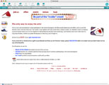 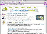  |
As the site and the program grew, the branding and visual presentation evolved without sacrificing the organization's established identity.
|
|
 return to client profiles list return to client profiles list
|